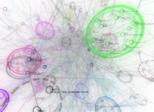
Marketing communications operates within an increasingly complex multi-stakeholder web of influences, and the way many of us can or will be able to devine how influence goes around and comes around, how reputations get built up and eroded, is to look at it pictorially.
My best attempt to date at explaining this in non-mathematical language is in my post "Can you see it? Making influence visible." Check it out. More widely, my post "Influence... it's a numbers game", lists all my posts related to this topic.
So I'm ever so interested in data visualisation, in case you hadn't guessed. But marketing communications is far from the only field look at visualising vast datasets to ease comprehension and interpretation; if anything, we're at the tail end. Which is no bad thing as we inherit the prior works of other sectors and put it to use more quickly than they were able.
But Skyrails is a very interesting project. Led by Yose Widjaja at the School of Computer Science and Engineering at the University of New South Wales, it is defined as a social network and graph visualisation system yet its applications are manifold.
The image at the top of this post is from the latest set of screenshots of Skyrails available here on Flickr, and reprents a visualisation of a protein structure. I have included some other static images below because not only are they beautiful but they whet your appetite for what could be achieved in visualising and understanding influence. I finish with a YouTube video that demonstrates how the data can be manipulated in a way a static image cannot convey.
Of all the sectors in which data visualisation is important, you could say biology is metaphorically closest to marketing communications. We talk, after all, about "virals", and the idea of "memes" comes from the study of genes. So when you take a look, try to view how this would work in analysing your campaign's biosystem.


Watch how Skyrails works...