There's a revolution coming in public relations... visualisation.

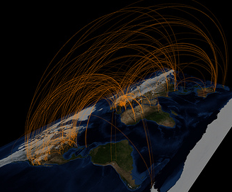
[Courtesy Christopher Baker]
Picture the scene
You hold an event to gather key stakeholders together, say a couple of dozen, and you want to maximise the positive networking such an event should catalyse. You're also aware of a few potential personality clashes. But how many one-to-one relationships are you actually trying to manage here?
It turns out, your relationship with each of them included, that there's 300 relationships in that room! Wow, and compared to the big 'World Wide Web', or the even bigger 'World' come to that, this is a relatively insignificant number of people.
Let's go a step further. Say that there's just five critical issues facing your industry, each of which has just three positions, say "for", "against" and "no position", then each stakeholder can have one of 243 combinations of points of view.
To complete this picture, imagine now communicating the dynamic of this group in a report back to your boss say. How do you represent 300 relationships and 243 combinations of positions? Moreover, how do you portray the network evolving year-to-year, month-to-month, hour-by-hour?
Welcome to the world of data visualisation.
Digesting data
Information technology has made the collation and manipulation of masses of data relatively mundane. When you're looking to manipulate data in a specific way, the machine can chunk through it pretty quickly and answer your defined and closed questions:
- What were the sales in week 39?
- How much did we invest in PR last year?
- In our last market research, how did our perceived value for money rate versus the competition?
But what if you don't know what you're looking for? How do you decipher the mass of data? How do you see what's going on so you can learn and respond appropriately? How can you answer undefined and open questions such as:
- What's the buzz amongst our customers?
- Who or what is exerting most influence?
- What trends should we know about?
- Who's most likely to have started this rumour?
- Who should we add to our list of key contacts / influencers?
- Who and what influenced Charles Arthur today?
Data and dimensions
Gathering the data is, of course, no mean feat. But the rise of the social Web presents the broadest and deepest pool marketers have ever had to swim in, and I cover this topic in The Social Web Analytics eBook 2008 (which, to my surprise, is being downloaded over 500 times a week!). Of course, there is also the little issue of who owns this information, which this article about the Social Graph on Read Write Web covers succinctly.
The next biggest challenge to spotting patterns and trends is simply that the data has more dimensions than we can cope with. Take your computer screen... two dimensional. Add some nifty mathematics and you can represent three dimensions. Change it over (compressed) time, and you can "see" four dimensions... but that's about the best we can achieve.
So now we have two new battles on our hands.
The first is presenting data brilliantly in the three or four dimensions we can deal with. And the second is building in some intelligence so that we're more than likely looking at the right combination of three or four dimensions amongst the dozens or hundreds represented in the data set.
Great visualisations
One of the fascinating outcomes of this new branch of public relations is the value non-geeks can literally "see" in it. There's a reason someone coined the term "a picture paints a thousand words". Perhaps "a data visualisation renders a million influences" will trip off the tongue in the future?! How cool is it to 'see' a meme?
And it's not coincidental that some visualisations are beautiful; not that I'm about to author a treatise on beauty, but heuristically it makes sense that we're more likely to find the interpretation of something that looks good easier than something that looks a mess.
I'll leave you with some visualisations, with hyperlinks to the source should you, like me, become entranced by visualisation.
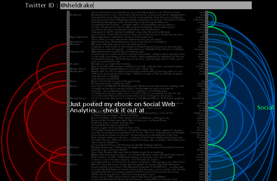
My TwitArc
http://www.neoformix.com/Projects/TwitArcs/TwitArcs.html
Visualising Flickr contacts
Courtesy of Eskimoblood on Flickr.

Twitter conversations map
Courtesy of Walter Rafelsberger on Flickr.
Facebook Visualiser
Courtesy Sebastian Van Sand, Visual Complexity.

MySpace Type Use
Courtesy of Felix Heinen.

Instant Messenger IRC Who Is Talking To Who?
Courtesy of Martin Dittus.

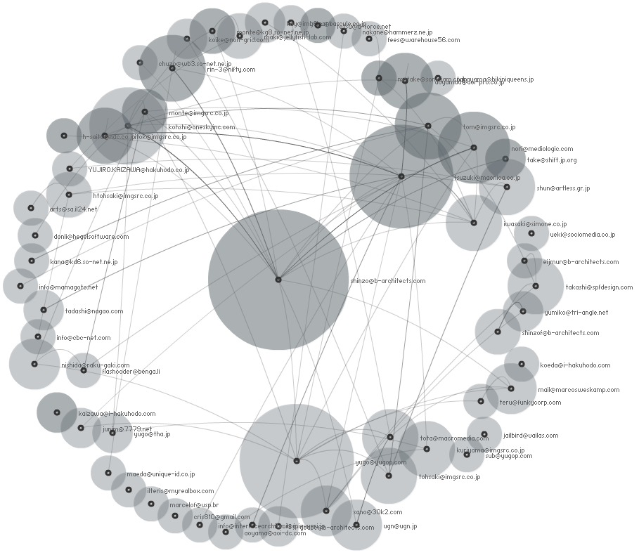
Social Circles - Mailing List Social Visualisation
Courtesy of Marumushi.
Genealogy of influence
Courtesy of goosebumps4all.net.

Touch Graph
Courtesy of Mike Love.

Anthony Hamelle says:
Philip,
Congratulations on this very interesting and mind-challenging post. Indeed, grasping influence in the offline world is something our industry had begun being accustomed to with circulation, viewership or other attendance criteria. However, how does one know where the influence is, where it stays dormant, when it gains momentum in online communities? Well, these issues are at the very core of what we do over at linkfluence. So we took you to your word and developed a nice application that makes influence even more visible than before.
http://linkfluence.net/en/news/2008/09/25/seeing-memes/
Anthony
25 September 2008 — 1:28 pm